
Invisible Products: The Importance of Considering Store Lighting in Packaging Design
As a Designer, packaging has always been a passion of mine. I love how this form of branding requires both 3-dimensional and 2-dimensional thinking to tell a story. For me, walking the aisles of a supermarket is like viewing a gallery exhibit. I enjoy seeing the latest trends applied to all of those tasty products. It’s also a great way to uncover real-world successes and pitfalls. Let me explain.
One of the mistakes I encounter pretty regularly is a failure to consider how store shelves will impact the packaging. Specifically, I’m talking about the heavy, dark shadows that upper shelves cast on lower ones.
There’s not much brands can do about the lights. However, there are steps you can take to reduce the negative effects on your brand. Here are my top three tips brand managers can use to address this challenge:
Avoid using big fields of dark colors. They may look good in a presentation but they completely fade into the shadows on a store shelf.
Identify the top three things your customers look for when making a purchasing decision and make sure they are prominent on the face panel of your package. Flavor, health benefits, and brand name are common attributes that customers seek out first. A good rule-of-thumb is to keep these messages in the middle third of the box. Too high, and they fall under the shadow. Too low, and they may get covered by promotional items attached to the shelves.
Appealing to people’s senses is a proven way to boost the appeal of your product. If your selling food, high quality, mouth-watering photography is a good place to start. In one study, Stella Artois added a photo to their 6-pack and increased its appeal by 66%!
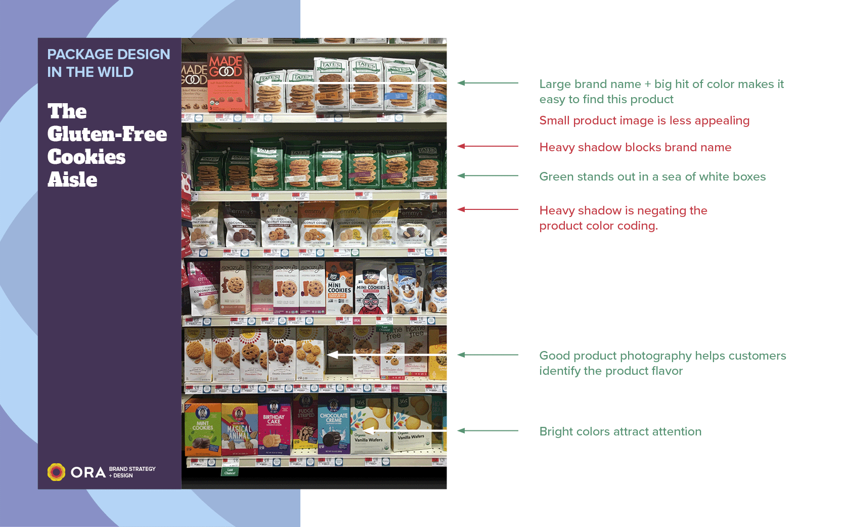
This photo of the Gluten-Free Cookie aisle in Whole Foods illustrates the challenges, and some of the solutions, I’ve described.
In conclusion, packaging design is a crucial element of branding and can have a significant impact on sales. However, Brand Managers must consider the challenges presented by the store environment, particularly the shadows that can make it difficult for customers to see products on lower shelves. By avoiding dark colors, keeping important information in the middle third of the box, and using high-quality photography, brands can improve the appeal of their products and stand out in crowded stores.
At Ora, we understand the importance of effective packaging design and offer a range of services to help brands create packaging that resonates with their customers and stand out on store shelves. Contact us today to learn more and see how we can help you take your packaging to the next level.